Posts tagged Canvas
Two Approaches to Page-Based Moodle Layouts
0Many of the school systems in the state of Utah have moved to Canvas as their choice of LMS. Canvas has been endorsed by UEN, and has been consistently gaining traction. At first, Weber School District was exploring this option, but decided against it. For one, assuming we used the hosted version of Canvas, it would be entirely too costly for a district of our size. Second, even if we used the self-hosted open source version, it would’ve required rebuilding in Ruby all the custom integration we’ve already built for Moodle. Third, our 200-something active Moodle-using teachers would have had to convert or rebuild their curricula in the new system. And fourth…well, we figured we could take the best parts of Canvas, and build something even better.
So we explored, analyzed, and researched exactly what was required to deliver the optimal hybrid and online course experience for our students and teachers. After a few months of design and development, we launched our new Moodle design in April 2012. And we’ve continually been making improvement and feature enhancements since then. We’ve done our best to address the needs of our teachers and students, and provide a framework that is clear, intuitive, and complimentary to both hybrid and fully online learning environments, while addressing the major concerns with our old system. So far, it’s been very well-received. I call the new layout “SimpleMoodle.”
SimpleMoodle
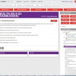 You’ll immediately notice the design strays from the traditional Topics or Weekly format most Moodlers are used to, and adopts a page-based layout. There are some page-based course formats like FlexPage by Moodlerooms, and one created by the University of Sussex. Pages encourage a logical, linear progression for teachers and students to follow. While this may not exactly accommodate all the instructional styles our teachers wish to use, we’ve built it to be flexible enough that most, if not all teachers will find it useful.
One of the major strengths of SimpleMoodle is the course navigation on the right. All pages are organized into a hierarchy, and are divided into units, topics, and pages, which should be pretty familiar to most teachers. The teacher can move these pages around the hierarchy tree by dragging and dropping. Pages can also be hidden so students can’t select them, or dropped into the Archive section at the bottom, which doesn’t show up for students at all. This way, teachers can save pages for later use without having them appear in the navigation.
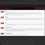 One of the complaints we’ve received about our old vanilla Moodle system is that it’s overwhelming. In the past, whenever we’ve provided Moodle training, teachers arrive at their empty slate of a Moodle course and just don’t know what to do. Given the time constraints and the sophistication of Moodle, we’d often only be able to teach them a fraction of the options. Sometimes simpler is better. We conducted a survey of our teachers and students and identified the most commonly used features, and made them readily available and identifiable by the red boxes. Clicking one of the “Add Resource,” “Add Assignment,” etc. boxes opens a popup window with more options and a description of each one.
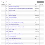 There are a few other pages that make the experience easier for students. The “Resources” and “Assignments” buttons at the top of each page take the student to a list of each activity and the unit number they’re located in. If a student is viewing the page and has completed an assignment, a checkmark appears next to it. If a teacher is viewing the page, a count of ungraded assignments shows up. The checkmarks and ungraded assignments counts appear in the hierarchical menu as well.
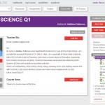 The “Course Info” page contains information about the teacher, and this is where the News forum is located, too. The teacher’s photo is shared here, as well as a short biography of them. From this page, the student can also view the syllabus or send the teacher a message. It’s a nice concise location for the most basic course information a student might find interesting.
We’re continuing to develop new features, and at some point in the future, we intend to make the SimpleMoodle course format and theme available for free download.
WEU Pages

For World Education University, I designed and built another page-based course format I’ve simply called “WEU Pages” (maybe I need to find a new naming guy). Instead of topics, this course format uses units. The focal point of each unit is a main activity, typically a SCORM file, with other resources and activities complimenting it and listed below. Progression through the course is fairly linear. As soon as a student completes one unit, they move on to the next.
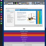
In editing mode, the teacher has extra features available. One is uploading an image to each unit listed in the horizontal navigation across the top. These images can be whatever the teacher thinks will visually describe the unit. Images uploaded are automatically resized to thumbnails. The teacher can also drag-and-drop the unit boxes to reorder them.
The editing teacher will also see a drop-down panel below the main activity, which shows the different features. Clicking one of the buttons shows a popup window similar to the one in SimpleMoodle, and the teacher picks which type of activity they want. To move activities to different units, the teacher simply needs to drag them up to the unit box. They’ll disappear from the current unit, and reappear in the desired unit.
One nice thing is that any Topics-based course can be gracefully converted to the WEU Pages course format. It degrades nicely as well. The course format takes the first available SCORM activity in the topic and makes it the “main activity” that shows in the larger box. In some cases, a Page resource or Quiz may become the main activity as well.
Related articles


